Greetings,
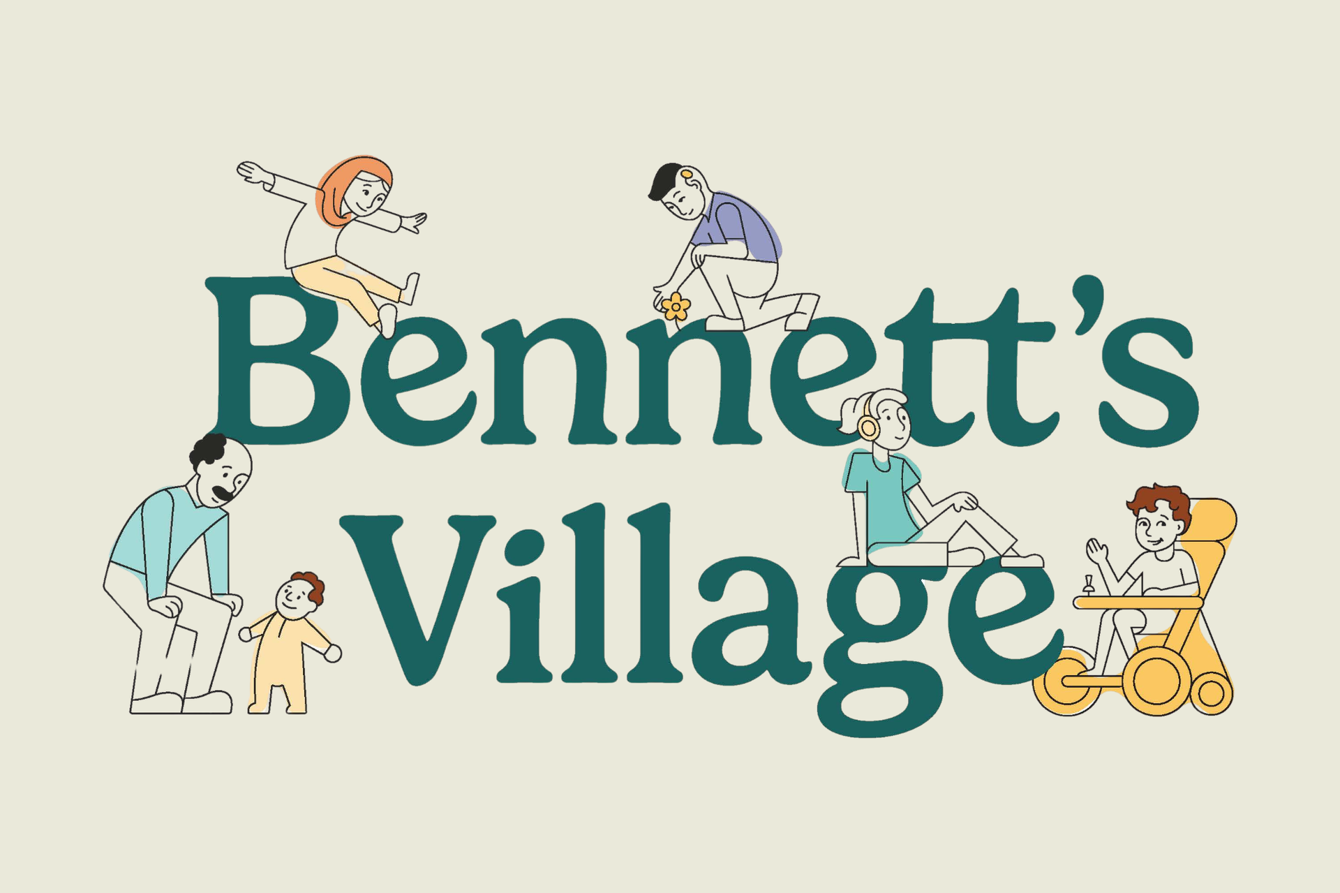
It’s time to share the work we, along with the excellent designers at Journey Group, have been doing over the past six months! As Bennett's Village grows, we wanted to create a new look that reflects that growth and helps us communicate our mission more fully. These new brand assets tell the playful story of Bennett’s Village using color, fonts, characters, and shapes that express our commitment to community, nature, accessibility, and inclusivity. We hope you will be inspired when you explore our refreshed website and social media. We look forward to continuing to share Bennett’s story and his dream for a place for all to play. Continue reading to learn more about the new branding and the thoughtfulness that went into its creation. |
|
|
With a shape that is reminiscent of the rocks that Bennett loved so much, our logo suggests movement. The design is clear, bold, and versatile. We can’t wait to see it emblazoned on a variety of merchandise and materials, such as t-shirts, water bottles, stickers, tote bags, and more! |
|
Image caption: A greenish-blue shape with seven irregular sides. In the center of the shape are the words "Bennett's Village" written in a playful white font. |
|
|
The two fonts selected for our materials were selected with an eye toward both creativity and accessibility. These fonts demonstrate our playful spirit while still being easy to read. | |
|
Starting with nature as our inspiration, we developed a primary color palette. This palette is complemented by a secondary one that embraces the joy of play.
We were inspired by the hues found in flowers, the sky, and the mountains that surround the playspace. | |
|
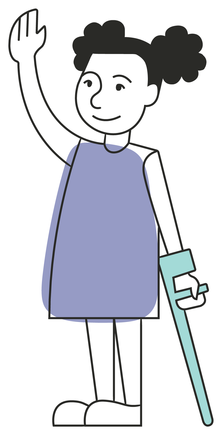
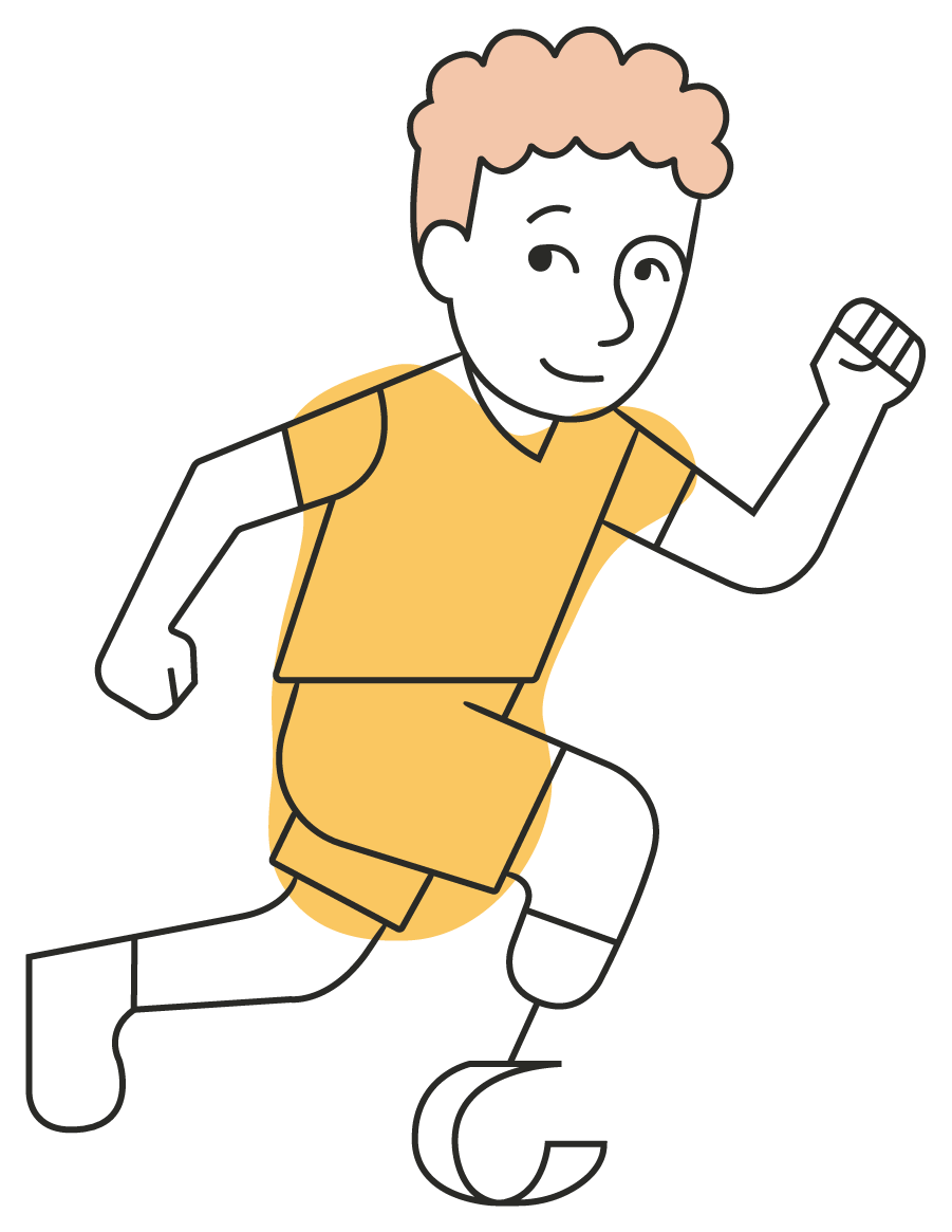
Building on the character set from our original logo, these new characters, including Bennett, reflect the variety of community members who will feel welcomed at the Bennett’s Village playspace. |
|
Image caption: An illustration of a waving girl in a purple dress. Her black hair is styled in two puff balls. She holds a light blue Loftstrand crutch in her left hand. |
|
|
Image caption: An illustration of a running boy in a yellow outfit. He has curly orange hair and wears a prosthetic running blade on his right leg. |
| Designed to be accessible to everyone regardless of age or ability, the playspace offers something for everyone to enjoy. Over time, we imagine our character set will continue to grow. |
|
|
Each graphic shape lends movement and variety to the branding materials, signifying the elements that will inhabit the playspace and the different ways that each can be used and enjoyed by community members. | |
|
You can find more details about our graphic design journey here. In addition, our flyer includes more details about the playspace and our plans for the future.
We are grateful to our friends at Journey Group for their thoughtful and painstaking commitment to retaining the origin story of Bennett’s Village as they brought the designs and branding elements to their fullest expression.
We’re celebrating the launch of our rebrand with some awesome branded t-shirts, water bottles, and totes. The fundraiser is up through the month of July, with delivery just in time for the beginning of the school year (8/19). We are offering two delivery options—direct to your door (for an additional fee) or you can pick them up from Kara for free.
Thank you for being a part of Bennett’s Village—we couldn’t have made it to this point without you! |
|
|
You are being sent this email because you are a subscriber. If you wish to update your Email Preferences or Unsubscribe, click *{{Unsubscribe}}* |
|
|
|